Tools
Figma, Miro
Descriptors
UI/UX Design, UX Research, Personas, Wireframing, Prototyping, Usability testing
Project Context
During Fall semester of my Sophomore year I took an Intermediate Interaction Design class. This class spent the semester focusing on making an app within the program Figma, making sure that it was something that was iterated upon based on real user feedback. We learned various concepts about UX/UI design and research and went through the entire process individually to have a final workable Figma prototype.
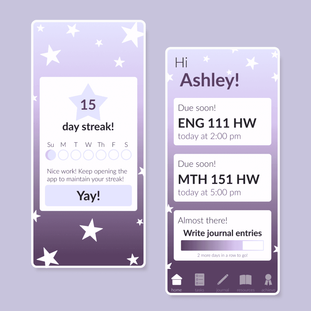
Figma Prototype
Project Process
Problem
There isn't a mental health task management and journaling app targeted to college students.
Solution
Creating a themed app focused on both being visually appealing but also having gamified aspects to keep users.
Creating a Persona
Before anything else, a user persona was made based on three initial interviews. Then three design tenets focused on consistency, customization, and aesthetics, were written.

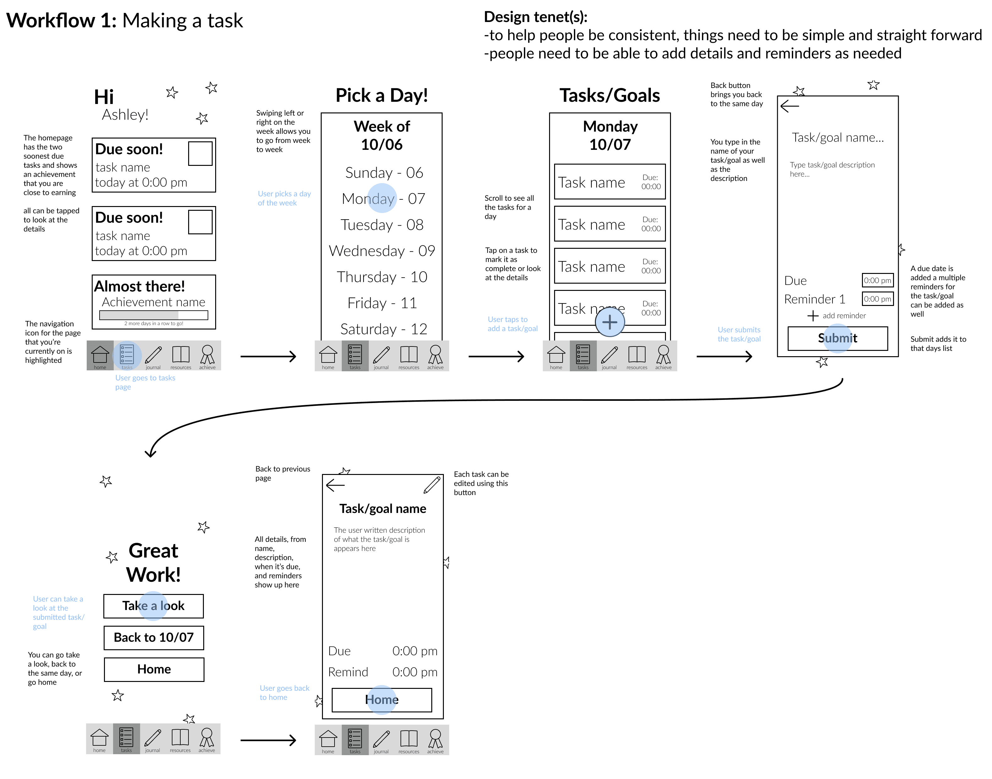
Workflow Sketches
Using user persona and design tenets, four main workflows were decided on. General pathway was made within Miro and then each workflow was sketched.


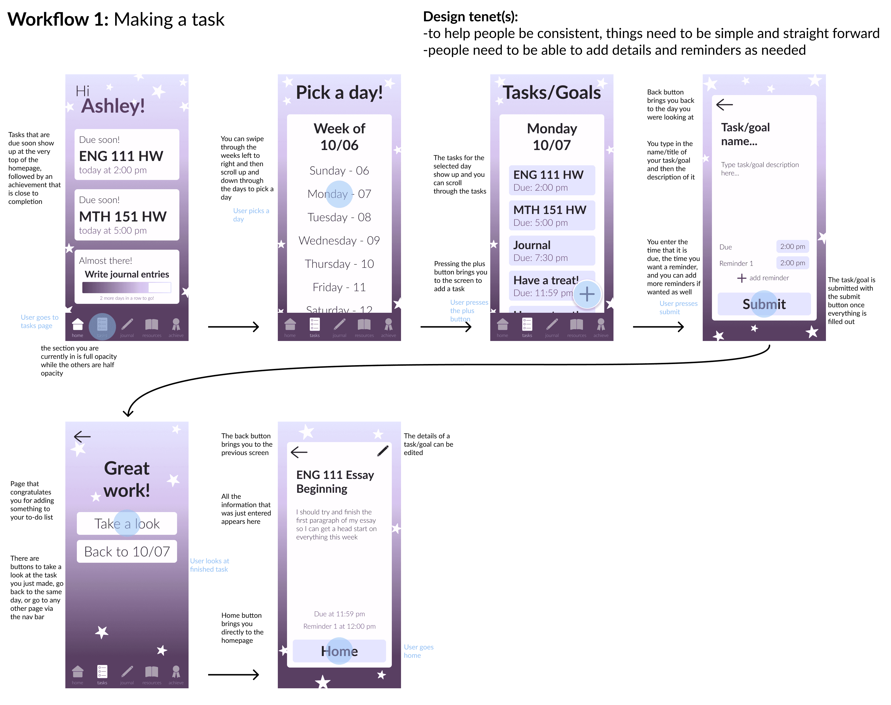
Lo-Fi & Hi-Fi Workflows
Lo-fi workflows were then created in Figma after receiving classmate feedback.
Again, feedback was received, and hi-fi workflows were created using branding and design focused choices I made.
Usability Testing and Iterating
Following the prototyping of hi-fi, I had five different participants test all four workflows. Notes on comments were taken to be referenced for iterations.
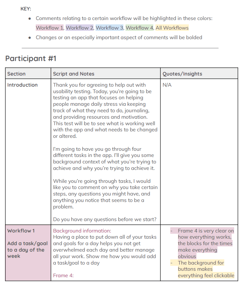
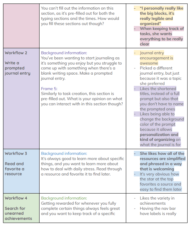
Using highlighted notes and quotes from participants of usability testing, adjustments were made to each workflow with their comments linked to each change that was made.

Final Workflows
After iterating on our workflows, we were also tasked with gamifying our app.
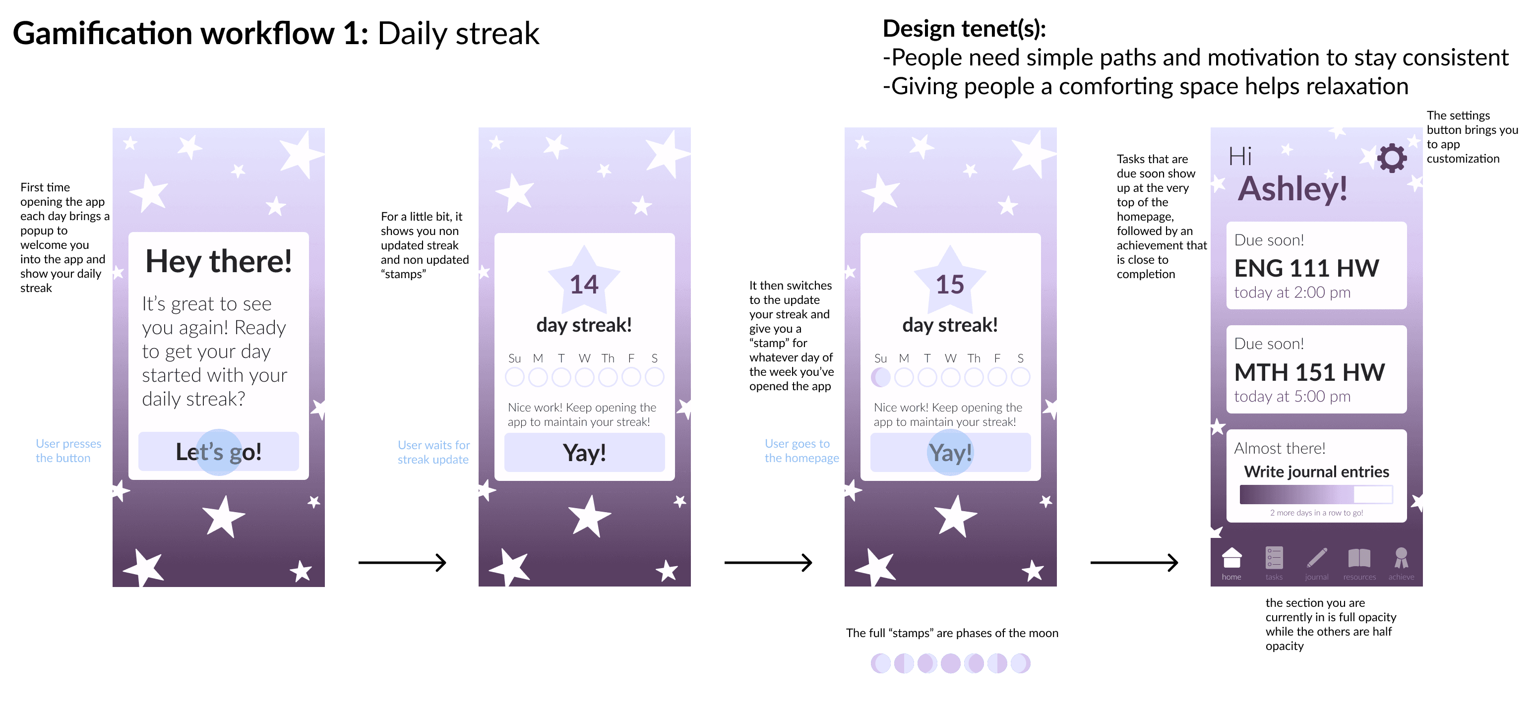
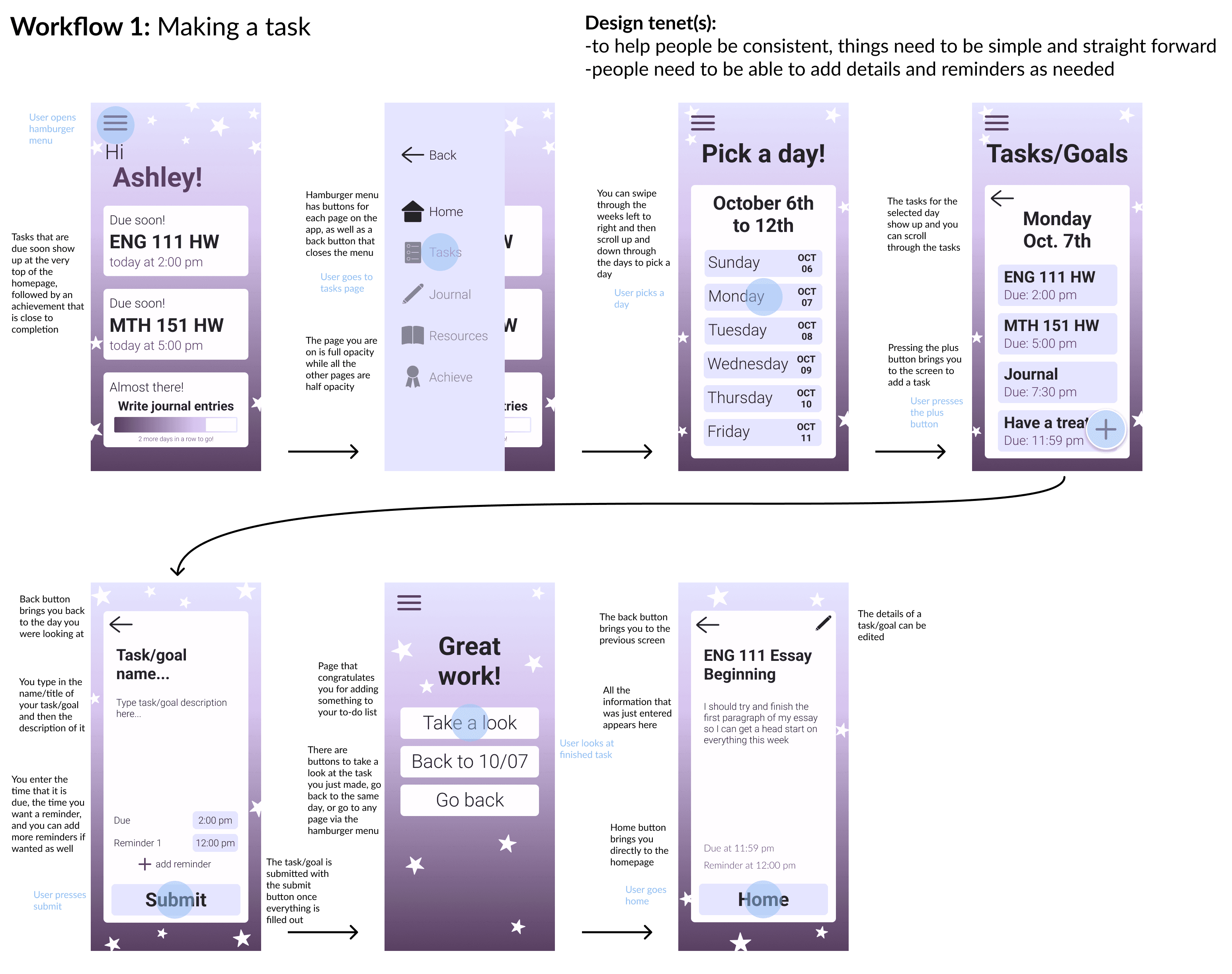
Our very last workflows included designing a hamburger style menu for Android devices.
Conclusion
This project was a huge learning experience to me, especially as it was my introduction to UX/UI research and design. I learned so much about the importance of user-centered design and how one goes about the process of making a design for a specific user.
This project especially showed me the importance of having specific comments from users so that you can tie quotes directly into changes you've made in your workflow.